Стилизация select
Содержание:
CSS Reference
CSS ReferenceCSS Browser SupportCSS SelectorsCSS FunctionsCSS Reference AuralCSS Web Safe FontsCSS Font FallbacksCSS AnimatableCSS UnitsCSS PX-EM ConverterCSS ColorsCSS Color ValuesCSS Default ValuesCSS Entities
CSS Properties
align-content
align-items
align-self
all
animation
animation-delay
animation-direction
animation-duration
animation-fill-mode
animation-iteration-count
animation-name
animation-play-state
animation-timing-function
backface-visibility
background
background-attachment
background-blend-mode
background-clip
background-color
background-image
background-origin
background-position
background-repeat
background-size
border
border-bottom
border-bottom-color
border-bottom-left-radius
border-bottom-right-radius
border-bottom-style
border-bottom-width
border-collapse
border-color
border-image
border-image-outset
border-image-repeat
border-image-slice
border-image-source
border-image-width
border-left
border-left-color
border-left-style
border-left-width
border-radius
border-right
border-right-color
border-right-style
border-right-width
border-spacing
border-style
border-top
border-top-color
border-top-left-radius
border-top-right-radius
border-top-style
border-top-width
border-width
bottom
box-decoration-break
box-shadow
box-sizing
break-after
break-before
break-inside
caption-side
caret-color
@charset
clear
clip
clip-path
color
column-count
column-fill
column-gap
column-rule
column-rule-color
column-rule-style
column-rule-width
column-span
column-width
columns
content
counter-increment
counter-reset
cursor
direction
display
empty-cells
filter
flex
flex-basis
flex-direction
flex-flow
flex-grow
flex-shrink
flex-wrap
float
font
@font-face
font-family
font-feature-settings
font-kerning
font-size
font-size-adjust
font-stretch
font-style
font-variant
font-variant-caps
font-weight
gap
grid
grid-area
grid-auto-columns
grid-auto-flow
grid-auto-rows
grid-column
grid-column-end
grid-column-gap
grid-column-start
grid-gap
grid-row
grid-row-end
grid-row-gap
grid-row-start
grid-template
grid-template-areas
grid-template-columns
grid-template-rows
hanging-punctuation
height
hyphens
@import
isolation
justify-content
@keyframes
left
letter-spacing
line-height
list-style
list-style-image
list-style-position
list-style-type
margin
margin-bottom
margin-left
margin-right
margin-top
max-height
max-width
@media
min-height
min-width
mix-blend-mode
object-fit
object-position
opacity
order
outline
outline-color
outline-offset
outline-style
outline-width
overflow
overflow-x
overflow-y
padding
padding-bottom
padding-left
padding-right
padding-top
page-break-after
page-break-before
page-break-inside
perspective
perspective-origin
pointer-events
position
quotes
resize
right
row-gap
scroll-behavior
tab-size
table-layout
text-align
text-align-last
text-decoration
text-decoration-color
text-decoration-line
text-decoration-style
text-indent
text-justify
text-overflow
text-shadow
text-transform
top
transform
transform-origin
transform-style
transition
transition-delay
transition-duration
transition-property
transition-timing-function
unicode-bidi
user-select
vertical-align
visibility
white-space
width
word-break
word-spacing
word-wrap
writing-mode
z-index
Больше
Fullscreen VideoМодальные коробкиШкалаИндикатор прокруткиСтроки хода выполненияПанель уменийПолзунки диапазонаПодсказкиPopupsСкладнойКалендарьHTML вставкаСписокПогрузчикиЗвездвРейтинг пользователейЭффект наложенияКонтактные фишкиКартыКарточка профиляОповещенияЗаметкиМеткиКругиКупонОтзывчивый текстФиксированный нижний колонтитулЛипкий элементОдинаковая высотаClearfixСнэк-барПрокрутка рисункаЛипкий заголовокТаблица ценПараллаксПропорцииПереключение типа/не нравитсяВключить скрытие/отображениеПереключение текстаПереключение классаДобавить классУдалить классАктивный классУвеличить HoverПереход при наведенииСтрелкиФормыОкно браузераНастраиваемая полоса прокруткиЦвет заполнителяВертикальная линияАнимация значковТаймер обратного отсчетаМашинкуСкоро страницаСообщения чатаРазделить экранОтзывыЦитаты слайд-шоуЗакрываемые элементы спискаТипичные точки останова устройстваПеретаскивание HTML-элементаКнопка спуска на входеJS медиа запросыJS анимацииПолучить элементы IFRAME
Атрибуты
| Атрибут | Значение | Описание |
|---|---|---|
| autofocus | autofocus | Указывает, что раскрывающийся список должен автоматически фокусироваться при загрузке страницы |
| disabled | disabled | Указывает, что раскрывающийся список должен быть отключен |
| form | form_id | Определяет, к какой форме относится раскрывающийся список |
| multiple | multiple | Указывает, что одновременно можно выбрать несколько параметров |
| name | name | Определяет имя раскрывающегося списка |
| required | required | Указывает, что пользователь должен выбрать значение перед отправкой формы |
| size | number | Определяет количество видимых параметров в раскрывающемся списке |
CSS
Мы использовали минимум разметки HTML для вывода элемента выбора и организации выпадающих пунктов. Если ограничивать проект использованием только предшествующих CSS3 технологий, то придется использовать значительно больше элементов div и span.
css/styles.css
#page{
	width:490px;
	margin:50px auto;
}

#page h1{
	font-weight:normal;
	text-indent:-99999px;
	overflow:hidden;
	background:url('../img/your_product.png') no-repeat;
	width:490px;
	height:36px;
}

#page form{
	margin:20px auto;
	width:460px;
}

.tzSelect{

	/* Контейнер для нового элемента select */

	height:34px;
	display:inline-block;
	min-width:460px;
	position:relative;

	/* Предварительная загрузка фонового изображения для выпадающих пунктов */
	background:url("../img/dropdown_slice.png") no-repeat -99999px;
}

.tzSelect .selectBox{
	position:absolute;

	height:100%;
	width:100%;

	/* Установка шрифта */

	font:13px/34px "Lucida Sans Unicode", "Lucida Grande", sans-serif;
	text-align:center;
	text-shadow:1px 1px 0 #EEEEEE;
	color:#666666;

	/* Использование множественных фонов CSS3 */

	background:url('../img/select_slice.png') repeat-x #ddd;
	background-image:url('../img/select_slice.png'),url('../img/select_slice.png'),url('../img/select_slice.png'),url('../img/select_slice.png');
	background-position:0 -136px, right -204px, 50% -68px, 0 0;
	background-repeat: no-repeat, no-repeat, no-repeat, repeat-x;

	cursor:pointer;

	-moz-border-radius:3px;
	-webkit-border-radius:3px;
	border-radius:3px;
}

.tzSelect .selectBox:hover,
.tzSelect .selectBox.expanded{
	background-position:0 -170px, right -238px, 50% -102px, 0 -34px;
	color:#2c5667;
	text-shadow:1px 1px 0 #9bc2d0;
}
CSS3 позволяет использовать несколько фоновых изображений для одного элемента, просто добавляя дополнительные объявления url() через запятую. Они добавляются к элементу сверху вниз, то есть, каждое следующее фоновое изображение выводится ниже предыдущего.
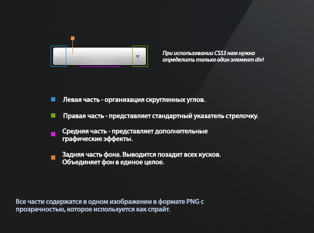
В настоящий момент множественные фоновые изображения поддерживаются в Firefox, Safari, Chrome и Opera. Для Internet Explorer и старых версий браузеров, определяется обходной вариант, который просто выводит обычный фон. При разборе документа CSS браузер, который не понимает инструкции для множественных фоновых изображений, просто игнорирует их и использует обычный вариант.
.tzSelect .dropDown{
	position:absolute;
	top:40px;
	left:0;
	width:100%;
	border:1px solid #32333b;
	border-width:0 1px 1px;
	list-style:none;

	-moz-box-sizing:border-box;
	-webkit-box-sizing:border-box;
	box-sizing:border-box;

	-moz-box-shadow:0 0 4px #111;
	-webkit-box-shadow:0 0 4px #111;
	box-shadow:0 0 4px #111;
}


.tzSelect li{
	height:85px;
	cursor:pointer;
	position:relative;

	/* Использование множественных фонов CSS3 */

	background:url('../img/dropdown_slice.png') repeat-x #222;
	background-image:url('../img/dropdown_slice.png'),url('../img/dropdown_slice.png'),url('../img/dropdown_slice.png');
	background-position: 50% -171px, 0 -85px, 0 0;
	background-repeat: no-repeat, no-repeat, repeat-x;
}

.tzSelect li:hover{
	background-position: 50% -256px, 0 -85px, 0 0;
}

.tzSelect li span{
	left:88px;
	position:absolute;
	top:27px;
}

.tzSelect li i{
	color:#999999;
	display:block;
	font-size:12px;
}

.tzSelect li img{
	left:9px;
	position:absolute;
	top:13px;
}
Свойство box-sizing, которое используется в классе .dropDown, определяет, как рамочка добавляется к общему размеру элемента. Обычно рамочка увеличивает общую ширину элемента на 2px и рушит все выравнивание. Присвоив свойству box-sizing значение border-box, мы предотвращаем увеличение общей ширины, так как рамочка будет размещаться внутри элемента.
Быстрый старт
Подключаем необходимые стили и библиотеки:
<link rel="stylesheet" type="text/css" href="path-to/cusel.css" />
<script type="text/javascript" src="path-to/jquery-1.6.1.js"></script>
<script type="text/javascript" src="path-to/cusel-min.js"></script>
<!-- если требуется поддержка ie6, учим его понимать альфапрозрачность для плавного обрезания текста -->
<!-->
<script type="text/javascript" src="path-to/DD_belatedPNG.js"></script>
<script type="text/javascript">
DD_belatedPNG.fix(".cuselFrameRight"); <!-- именно этот элемент имеет полупрозрачность -->
jQuery(document).ready(function(){ <!--делаем эмуляцию min-width: 100% для выпадающего списка для IE6 (спасибо Константину Ершову) -->
jQuery(".cusel").each(
function(){
	var w = parseInt(jQuery(this).width()),
		scrollPanel = jQuery(this).find(".cusel-scroll-pane");
	if(w>=scrollPanel.width())
	{
		jQuery(this).find(".jScrollPaneContainer").width(w);
		scrollPanel.width(w);
	}
});
});
</script>
<!-->
Инициализируем cusel, указывая, где и как стилизовать select:
jQuery(document).ready(function(){
var params = {
		changedEl: ".lineForm select",
		visRows: 5,
		scrollArrows: true
	}
	cuSel(params);
});
А теперь подробней.
Как это работает
- находятся все указанные селекты на странице
-
заменяется каждый select
<select id="idSelect" name="nameSelect">
<option value="значение option 1">текст option 1</option>
...
<option value="значение option N">текст option N</option>
</select>
на конструкцию вида:
<div class="cusel" id="cuselFrame-idSelect">
	<div class="cuselFrameRight"></div>
	<div class="cuselText">текст option 1</div>
	<div class="cusel-scroll-wrap">
		<div class="cusel-scroll-pane" id="cusel-scroll-idSelect">
		<span class="cuselActive" value="значение option 1">текст option 1</span>
		...
		<span value="значение option N">текст option N</span>
		</div>
	</div>
	<input id="idSelect" name="nameSelect" value="значение option 1" type="hidden"/>
</div>
- обычные select удаляются
Заметка
Обязательным условием является указание id селекту, т.к. на основании этого уникального идентификатора гарантируется работа скроллингов в выпадающих меню.
Приоритет селекторов
Когда в CSS имеется несколько правил, устанавливающих одно и тоже CSS свойство некоторому элементу, приоритетным из них является то, в котором селектор имеет большую специфичность (вес).
Специфичность селекторов удобно представлять в виде 4 чисел: .
При этом сравнение селекторов по весу нужно выполнять слева направо. Если первая цифра одного селектора больше, чем у другого, то он является более специфичным и к элементу будет применяться CSS-свойство, заданное в нём. Если цифры равны, то выполняем сравнение следующих цифр селекторов и т.д.
Если у сравниваемых селекторов все цифры равны, то будет применяться тот, который ниже из них расположен по коду.
Как считать эти цифры? Каждый селектор в зависимости от типа имеет вес:
- универсальный селектор (не добавляет вес) – ;
- селекторы по тегу, псевдоэлемент добавляют единичку к четвёртой цифре – ;
- селекторы по классу и по атрибуту, псевдоклассы добавляют единичку ко третьей цифре – ;
- селектор по идентификатору добавляют единичку ко второй цифре – ;
Стили, расположенные в атрибуте элемента, являются более специфичными по сравнению с селекторами. Вес этих стилей определяется единицей в первой цифре – .
Например:
- – ;
- – ;
- – ;
- – ;
- – ;
- – ;
- – ;
- – ;
- – ;
- – ;
Повысить важность определённого CSS свойства можно с помощью ключевого слова. В этом случае будет использоваться именно данное CSS-свойство
Например:
<div class="alert-warning" style="background-color: #ffc107;"> ... </div>
В CSS:
.alert-warning {
  background-color: #ffa000 !important;
}
В этом примере элементу будет установлен тот фон к которому добавлено слово . перебивает любой вес.
Интересный случай, когда нужно определить какое значение CSS-свойства будет применено к элементу, если добавлено к нескольким из них.
В этом случае будет применено то значение CSS-свойства c у которого больше вес селектора.
К примеру, если добавить к CSS-свойству расположенному в , то получим максимальную возможную специфичность, которую уже никак не перебьёшь.
Например:
<p id="message" style="font-size: 20px !important;">...</p>
CSS:
p#message {
  font-size: 16px !important;
}
В этом примере к элементу будет применено CSS-свойство со значением 20px, т.к. хоть у каждого из них имеется состояние , но специфичность style () больше чем у селектора ().
Меню
Панель значковЗначок менюАккордеонВкладкиВертикальные вкладкиЗаголовки вкладокВкладки полной страницыВверх НавигацияОтзывчивый TopnavПанель поискаИсправлена боковая панельБоковая навигацияПолноэкранная навигацияМеню Off-CanvasНаведение с помощью кнопокМеню горизонтальной прокруткиВертикальное менюНижняя навигацияОтзывчивый снимок NavСсылки на нижнюю границуСсылки справаЦентрированные ссылки менюИсправлено менюСлайд-шоу в прокруткеСкрыть Navbar в прокруткеПрикрепленное NavbarВыпадающие окна HoverНажмите «Раскрывающиеся окна»Раскрытие в ТопнавеРаспространение в СиденеОткроется панель NavbarDropupMega MenuпагинацияПанировочные сухариГруппа кнопокГруппа вертикальных кнопокВажная социальная панельОтзывчивый заголовок
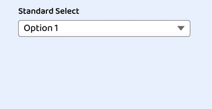
Custom Select Box Styles#
First, let’s set up some CSS variables. This will allow our select to be flexibly re-colored such as to represent an error state.
Now it’s time to create the custom select styles which we will apply to the our wrapping :
First, we set up some width constraints. The and values are mostly for this demo, and you may choose to drop or alter it for your use case.
Then we apply some box model properties, including , , and . Note the use of the unit which will keep these properties proportional to the set .
In the reset styles, we set several properties to , so here we define those, including , , and .
Finally, we supply it background properties, including a gradient for the slightest bit of dimension. If you remove the background properties, the select will be transparent and pick up the page background. This may be desirable, however, be aware and test the effects on contrast.
And here’s our progress:

Custom Select Dropdown Arrow
For our dropdown arrow, we are going to use one of the most exciting modern CSS properties: .
Clip paths let us make all kind of shapes by «clipping» the otherwise square and rectangle shapes we receive as defaults from most elements. I had fun using on my recent portfolio site redesign.
Prior to having better support, alternative methods included:
- — typically a png, slightly more modern would be an SVG
- an inline SVG as an additional element
- the to create a triangle
SVG may feel like the optimal solution, however when used as a it loses the ability to act like an icon in the sense of not being able to alter its properties such as fill color without redefining it entirely. This means we cannot use our CSS custom variable.
Placing an SVG inline solves the color issue, however it means including one more element every time a is defined.
With , we get a crisp, scalable arrow «graphic» that feels like an SVG but with the benefits of being able to use our custom variable and being contained in the style vs. the HTML markup.
To create the arrow, we will define it as an pseudo-element.
The syntax is a little strange, and since it’s not really the focus of this article, I recommend the following resources:
- Colby Fayock explans the syntax with an example in this egghead video
- Clippy is an online tool that allows you to select a shape and adjust the points while dynamically generating the CSS
If you’re following along, you may have noticed the arrow is not appearing despite defining and . When inspected, its found that the is not actually being allowed it’s width.
We will resolve this by updating our to use CSS grid layout.
This lets the arrow appear by essentially extending it a display value akin to «block».

At this stage we can verify that we have indeed created a triangle.
To fix the alignment, we’ll use my favorite CSS grid hack (old hat to you if you’ve read a few articles around here!).
Old CSS solution:
New CSS solution: A single to contain them all
First we’ll define our area, then define that the and the both use it. The name is scoped to the element its created for, and we’ll keep it easy by calling it «select»:
Which gives us an overlap of the arrow above the native select due to stacking context via source order:

We can now use grid properties to finalize the alignment of each element:
Ta-da!

State
Oh yeah — remember how we removed the ? We need to resolve the missing state from dropping that.
There is an upcoming property we could use called but it’s still best to include a polyfill for it at this time.
For this tutorial, we’ll use an alternate method that achieves the same result, just a bit heftier.
Unfortunately, this means we need to add one more element into the DOM.
After the native select element, as the last child within , add:
Why after? Because since this is a pure CSS solution, placing it after the native select means we can alter it when the is focused by use of the adjacent sibling selector — .
This allows us to create the following rule:
You may be wondering why we’re back to after just learning the previous hack.
The reason is to avoid recalculating adjustments based on padding. If you try it on your own, you’ll see that even setting and to 100% still makes it sit within the padding.
The job does best is matching the size of an element. We’re pulling it an extra pixel in each direction to make sure it overlaps the border property.
But, we need to make one more addition to to ensure that it’s relative to our select by — well, .
And here’s our custom select all together as seen in Chrome:
JavaScript
JS Array
concat()
constructor
copyWithin()
entries()
every()
fill()
filter()
find()
findIndex()
forEach()
from()
includes()
indexOf()
isArray()
join()
keys()
length
lastIndexOf()
map()
pop()
prototype
push()
reduce()
reduceRight()
reverse()
shift()
slice()
some()
sort()
splice()
toString()
unshift()
valueOf()
JS Boolean
constructor
prototype
toString()
valueOf()
JS Classes
constructor()
extends
static
super
JS Date
constructor
getDate()
getDay()
getFullYear()
getHours()
getMilliseconds()
getMinutes()
getMonth()
getSeconds()
getTime()
getTimezoneOffset()
getUTCDate()
getUTCDay()
getUTCFullYear()
getUTCHours()
getUTCMilliseconds()
getUTCMinutes()
getUTCMonth()
getUTCSeconds()
now()
parse()
prototype
setDate()
setFullYear()
setHours()
setMilliseconds()
setMinutes()
setMonth()
setSeconds()
setTime()
setUTCDate()
setUTCFullYear()
setUTCHours()
setUTCMilliseconds()
setUTCMinutes()
setUTCMonth()
setUTCSeconds()
toDateString()
toISOString()
toJSON()
toLocaleDateString()
toLocaleTimeString()
toLocaleString()
toString()
toTimeString()
toUTCString()
UTC()
valueOf()
JS Error
name
message
JS Global
decodeURI()
decodeURIComponent()
encodeURI()
encodeURIComponent()
escape()
eval()
Infinity
isFinite()
isNaN()
NaN
Number()
parseFloat()
parseInt()
String()
undefined
unescape()
JS JSON
parse()
stringify()
JS Math
abs()
acos()
acosh()
asin()
asinh()
atan()
atan2()
atanh()
cbrt()
ceil()
clz32()
cos()
cosh()
E
exp()
expm1()
floor()
fround()
LN2
LN10
log()
log10()
log1p()
log2()
LOG2E
LOG10E
max()
min()
PI
pow()
random()
round()
sign()
sin()
sqrt()
SQRT1_2
SQRT2
tan()
tanh()
trunc()
JS Number
constructor
isFinite()
isInteger()
isNaN()
isSafeInteger()
MAX_VALUE
MIN_VALUE
NEGATIVE_INFINITY
NaN
POSITIVE_INFINITY
prototype
toExponential()
toFixed()
toLocaleString()
toPrecision()
toString()
valueOf()
JS OperatorsJS RegExp
constructor
compile()
exec()
g
global
i
ignoreCase
lastIndex
m
multiline
n+
n*
n?
n{X}
n{X,Y}
n{X,}
n$
^n
?=n
?!n
source
test()
toString()
(x|y)
.
\w
\W
\d
\D
\s
\S
\b
\B
\0
\n
\f
\r
\t
\v
\xxx
\xdd
\uxxxx
JS Statements
break
class
continue
debugger
do…while
for
for…in
for…of
function
if…else
return
switch
throw
try…catch
var
while
JS String
charAt()
charCodeAt()
concat()
constructor
endsWith()
fromCharCode()
includes()
indexOf()
lastIndexOf()
length
localeCompare()
match()
prototype
repeat()
replace()
search()
slice()
split()
startsWith()
substr()
substring()
toLocaleLowerCase()
toLocaleUpperCase()
toLowerCase()
toString()
toUpperCase()
trim()
valueOf()
HTML Теги
<!—…—><!DOCTYPE><a><abbr><acronym><address><applet><area><article><aside><audio><b><base><basefont><bdi><bdo><big><blockquote><body><br><button><canvas><caption><center><cite><code><col><colgroup><data><datalist><dd><del><details><dfn><dialog><dir><div><dl><dt><em><embed><fieldset><figcaption><figure><font><footer><form><frame><frameset><h1> — <h6><head><header><hr><html><i><iframe><img><input><ins><kbd><label><legend><li><link><main><map><mark><meta><meter><nav><noframes><noscript><object><ol><optgroup><option><output><p><param><picture><pre><progress><q><rp><rt><ruby><s><samp><script><section><select><small><source><span><strike><strong><style><sub><summary><sup><svg><table><tbody><td><template><textarea><tfoot><th><thead><time><title><tr><track><tt><u><ul><var><video>
Используем счетчик CSS
Что такое счетчик CSS? Счетчик CSS — функция, которую можно использовать в свойстве для псевдо-элемнета. Можно считать все, что угодно. Количество элементов в статье или заголовков , и так далее. В нашем примере мы подсчитываем количество элементов . Так мы можем динамически передавать псевдо-элемнетам :before/:after числовое значение, которое позволит нумеровать пункты списка.
Свойство CSS counter включено в спецификацию . Таким образом, оно поддерживается в IE8. Конечно, оно не будет работать в IE7 & IE6, но для них можно просто определить числовой тип .
Код CSS
Код HTML не изменится. А в CSS мы будем использовать часть из предыдущих примеров (чтобы сохранить общий стиль демонстрационной страницы). А остальной код будет выглядеть следующим образом:
ol.third-example { counter-reset: li; }

ol.third-example li { position: relative; }

ol.third-example li:before {
	content: counter(li);
	counter-increment: li;
	background: #f692bb;
	color: #333;
	font: bold 14px/20px sans-serif;
	height: 20px;
	text-align: center;
	width: 20px;
	position: absolute;
	left: 0;
	top: 8px;
	-webkit-border-radius: 10px;
	   -moz-border-radius: 10px;
	        border-radius: 10px;
	-webkit-box-shadow: inset 0 0 5px #F0498D, 2px 2px 0 rgba(0,0,0,.15);
	   -moz-box-shadow: inset 0 0 5px #F0498D, 2px 2px 0 rgba(0,0,0,.15);
		box-shadow: inset 0 0 5px #F0498D, 2px 2px 0 rgba(0,0,0,.15);
}
Примечание: относительное позиционирование пункта списка является необходимым условием, так как псевдо-элемент внутри будет позиционироваться абсолютно.
Для правильного использования функции нужно три условия:
- Счетчик соответствующих элементов должен быть сброшен
- Счетчику нужно указать шаг увеличения (можно использовать любые значения, в демонстрации применяется значение по умолчанию)
- Функция должна размещаться в свойстве , и ей надо указать, что считать
Первое условие выполняется добавлением свойства к родительскому контейнеру элемента, который надо считать. В значение свойства указывается элемент, который будет подсчитываться. Если вам нужно считать количество параграфов в статье, то счетчик нужно сбросить следующим образом в наборе правил CSS:
body { counter-reset: p; }
/* Или */
article { counter-reset: p; }
Затем надо добавить свойство к псевдо-элемнету. Оно указывает, какой элемент считать и насколько увеличивать счетчик.
li:before { counter-increment: li 5; }
В данном примере счетчик увеличивается на 5. По умолчанию используется 1.
В завершении добавляем функцию в свойство псевдо-элемнета, чтобы использовать текущее значение счетчика для формирования содержания.
Multiple Select#
Selects come in a second flavor, which allows a user to select more than one option. From the HTML perspective, this simply means add the attribute, but we’ll also add a class to help create style adjustments called :
And looking at it, we can see it’s inherited most of our styles favorably, except we don’t need the arrow in this view.
This is a quick fix to adjust our selector that defines the arrow. We use to exclude our newly defined class:
We have a couple of minor adjustments to make for the multiple select, the first is removing padding that was previously added to make room for the arrow:
By default, options with a long value will overflow visible area and be clipped, but I found that the main browsers allow the wrapping to be overridden if you desire:
Optionally, we can set a on the select to bring a bit more reliable cross-browser behavior. Through testing this, I learned that Chrome and Firefox will show a partial option, but Safari will completely hide an option that is not able to be fully in view.
The height must be set directly on the native select. Given our other styles, the value will be able to show 3 options:
At this point, due to current browser support, we have made as much adjustments as we are able.
jquery.sb.js Selectbox Replacement
Объем:Доп функции:
- Реализованы стандартные функции обычных селектовов
- Можно через alt вставлять любую разметку внутрь опций (втом числе картинки)
Требования:
- jQuery 1.3.2+ (на jQuery 1.5.1 тоже работает)
- jquery.ba-throttle-debounce.min.js
- jquery.tie.js
Достоинства:
- очень прост в установке
- есть мультиселект
- есть подгруппы
- можно отключать опции
- автоподстраивает ширину
- реагирует на Tab
- реагирует на стрелки клавиатуры
- реагирует на скролл
Недостатки:
- не работает в IE6, просто оставляет стандартные
- не знает «умного позиционирования»
- тяжело пользоваться без стандартного описания
The CSS Grouping Selector
The grouping selector selects all the HTML elements with the same style
definitions.
Look at the following CSS code (the h1, h2, and p elements have the same
style definitions):
h1
{
text-align: center; color: red;
}h2
{
text-align: center; color: red;}p
{
text-align: center; color: red;
}
It will be better to group the selectors, to minimize the code.
To group selectors, separate each selector with a comma.
Example
In this example we have grouped the selectors from the code above:
h1, h2, p
{
text-align: center; color: red;}
All CSS Simple Selectors
| Selector | Example | Example description |
|---|---|---|
| #id | #firstname | Selects the element with id=»firstname» |
| .class | .intro | Selects all elements with class=»intro» |
| element.class | p.intro | Selects only <p> elements with class=»intro» |
| * | * | Selects all elements |
| element | p | Selects all <p> elements |
| element,element,.. | div, p | Selects all <div> elements and all <p> elements |
❮ Previous
Next ❯
Атрибуты
| Атрибут | Значение | Описание |
|---|---|---|
| autofocus | autofocus | Указывает, что выпадающий список должен автоматически получать фокус при загрузке страницы. |
| disabled | disabled | Логический атрибут, который указывает, что выпадающий список должен быть отключен. |
| form | form_id | Задает одну, или несколько форм к которым элемент принадлежит. |
| multiple | multiple | Логический атрибут, который указывает, что может быть выбрано несколько вариантов сразу (через Ctrl в Windows и через Command в Mac). |
| name | name | Определяет имя для выпадающего списка. |
| required | required | Указывает, что пользователь должен выбрать значение перед отправкой формы. |
| size | number | Определяет число видимых опций в выпадающем списке. |
Examples
The Attribute
Here, we use the attribute to ensure that an option is the default selection (i.e. it is already selected as soon as the page loads).
In this case, we specify that Chiang Mai is the default selection.
Using the Element
Items within a element can be sorted into logical groups. You can do this using the element.
Here, we group a list of cities by country.
Using the Element
The tag can be used with the and tags to provide a list of suggestions for the user. These aren’t necessarily all available options, just a mere list of suggestions.
Try typing the letter «B» into the field below. Then try «H». Then try say, «M».
Your browser may also provide a means for seeing all available options. However, there’s nothing to stop you from entering an option that’s not on the list.
CSS
Как видно на приведенном выше фрагменте кода HTML, у нас есть неупорядоченные списки вложенные в основной элемент
Поэтому нужно писать код CSS с особым вниманием. Нам не нужно, чтобы стили верхнего элемента каскадно применялись к вложенным спискам
Вот именно для таких задач и предназначен селектор потомков ‘>‘:
#colorNav > ul{
	width: 450px;
	margin:0 auto;
}
Здесь устанавливаются ширина и поля только для первого неупорядоченного списка, который является прямым потомком пункта #colorNav. Держим в уме сей факт и посмотрим, как будет выглядеть пункт меню:
#colorNav > ul > li{ /* стили только для элементов li верхнего уровня */
	list-style: none;
	box-shadow: 0 0 10px rgba(100, 100, 100, 0.2) inset,1px 1px 1px #CCC;
	display: inline-block;
	line-height: 1;
	margin: 1px;
	border-radius: 3px;
	position:relative;
}
Так как мы установили значение inline-block для свойства display, то пункты списка будут выводиться в одну линию. Также мы используем относительное позиционирование, чтобы правильно задавать смещение выпадающего списка. Элемент ссылки содержит иконку, которая определяется шрифтом Font Awesome.
#colorNav > ul > li > a{
	color:inherit;
	text-decoration:none !important;
	font-size:24px;
	padding: 25px;
}
Теперь мы можем перемещать выпадающий список . Определяем анимацию перехода CSS3. Устанавливаем максимальную высоту 0 px чтобы скрыть выпадающий список. При наведении курсора мыши будем анимировать изменение максимальной высоты до больших значений, что приведет к плавному появлению списка:
#colorNav li ul{
position:absolute;
list-style:none;
text-align:center;
width:180px;
left:50%;
margin-left:-90px;
top:70px;
font:bold 12px ‘Open Sans Condensed’, sans-serif;
/* Важно для анимации вывода/скрытия */
max-height:0px;
overflow:hidden;
-webkit-transition:max-height 0.4s linear;
-moz-transition:max-height 0.4s linear;
transition:max-height 0.4s linear;
}
Запуск анимации:
#colorNav li:hover ul{
	max-height:200px;
}
Значение 200px установлено произвольно и вам придется увеличить его, если выпадающий список будет содержать больше пунктов, не вмещающихся по высоте. К сожалению, нет способов определить высоту с использованием только CSS, поэтому применяется жесткое определение.
Далее определяем стили для выпадающих пунктов:
#colorNav li ul li{
	background-color:#313131;
}

#colorNav li ul li a{
	padding:12px;
	color:#fff !important;
	text-decoration:none !important;
	display:block;
}

#colorNav li ul li:nth-child(odd){ /* полоски зебры */
	background-color:#363636;
}

#colorNav li ul li:hover{
	background-color:#444;
}

#colorNav li ul li:first-child{
	border-radius:3px 3px 0 0;
	margin-top:25px;
	position:relative;
}

#colorNav li ul li:first-child:before{ /* указатель подсказки */
	content:'';
	position:absolute;
	width:1px;
	height:1px;
	border:5px solid transparent;
	border-bottom-color:#313131;
	left:50%;
	top:-10px;
	margin-left:-5px;
}

#colorNav li ul li:last-child{
	border-bottom-left-radius:3px;
	border-bottom-right-radius:3px;
}
И определяет несколько веселеньких цветов:
#colorNav li.green{
	/* Цвет пункта меню */
	background-color:#00c08b;

	/* Цвет иконки */
	color:#127a5d;
}

#colorNav li.red{		background-color:#ea5080;color:#aa2a52;}
#colorNav li.blue{		background-color:#53bfe2;color:#2884a2;}
#colorNav li.yellow{	background-color:#f8c54d;color:#ab8426;}
#colorNav li.purple{	background-color:#df6dc2;color:#9f3c85;}
Одним из преимуществ использования иконок в шрифтах является простая процедура установки цвета. Все настройки можно выполнить с помощью кода CSS.
